Big update to share!
After a fruitful meeting with the User Experience working group earlier this year, we’ve given this page a full facelift, and we’re excited to share it with you!
Update 2021-01-06: this is released and can be accessed from your dashboard
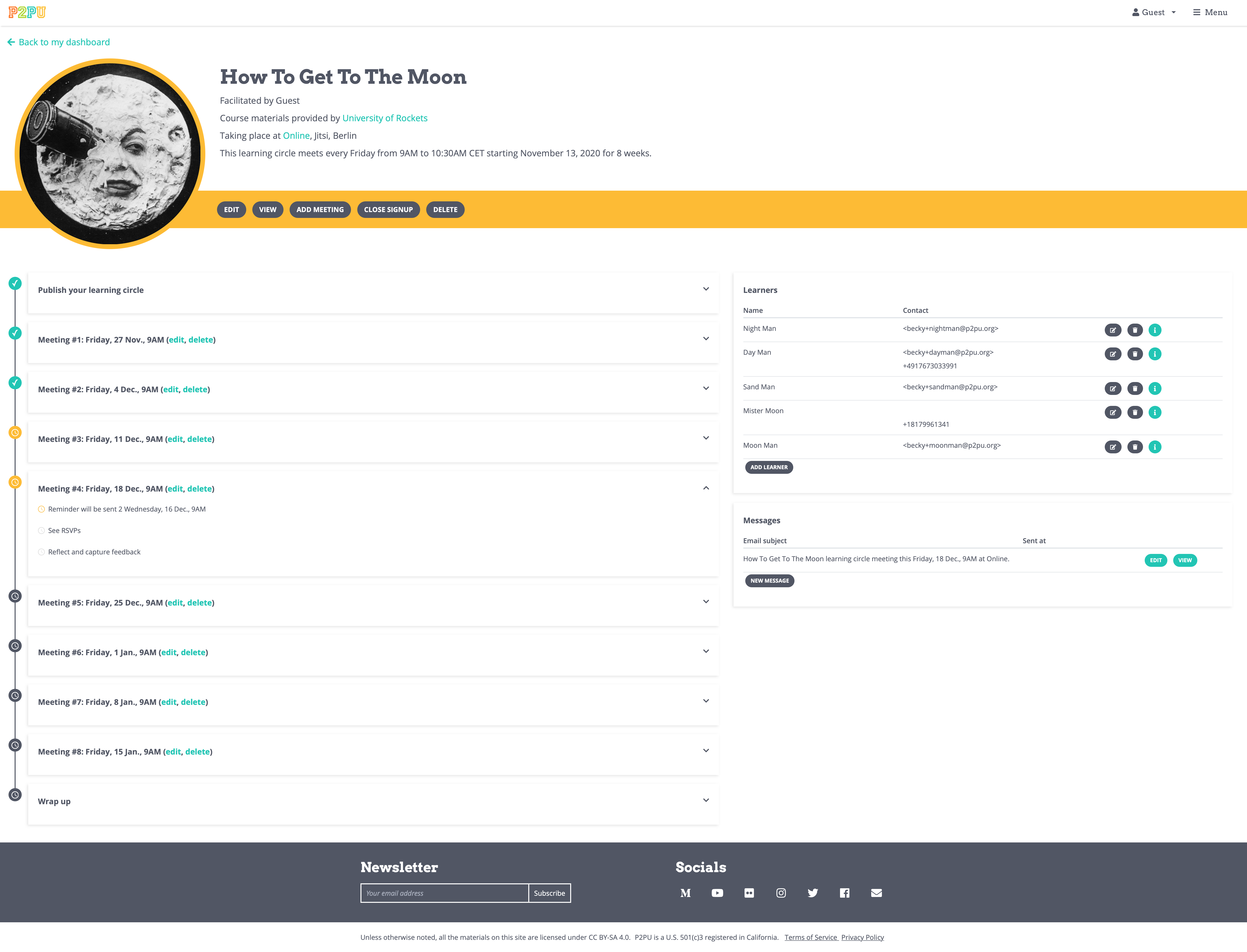
 See the new LC Management page

Screenshot of the new learning circle management page. Click to view full-size.
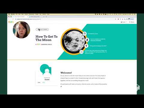
^ Video walkthrough of the page and its features. (View on Youtube for closed captions)
 What’s changed?
All of the tools and functions of the current page (see screenshot) are still present in the new design. While we haven’t added any brand new features yet, we think this is a much clearer presentation of the functions needed to run a learning circle as well as a great canvas for what can come next.
Meetings
We’ve changed to a linear representation of a learning circle, showing the path from start to finish: publishing the sign-up page (if submitted as a draft), tasks for each meeting, and collecting feedback surveys at the end.
Learners
In response to requests from facilitators, we’ve separated out the learner contact information and hidden the survey response questions by default to cut down on visible text on the page.
Messages
Messages are now much tidier. It’s easier to see when automatic messages will go out, and you no longer have to scroll past all of the content from messages past. You can also see where messages will go out in the context of each learning circle meeting.
Tell us what you think!
We’d love to hear your thoughts:
- Does this feel like an improvement to the current page?
- Is there anything you’d change?
- What new features or functionality would you like to see on this page?

