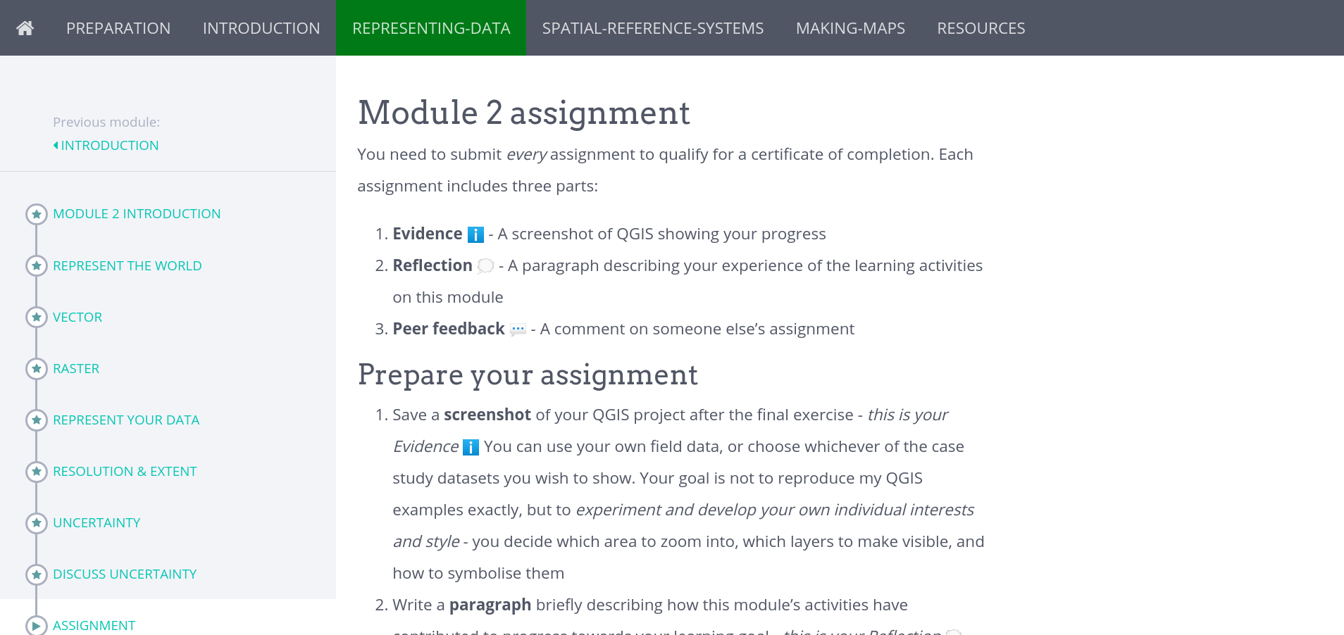
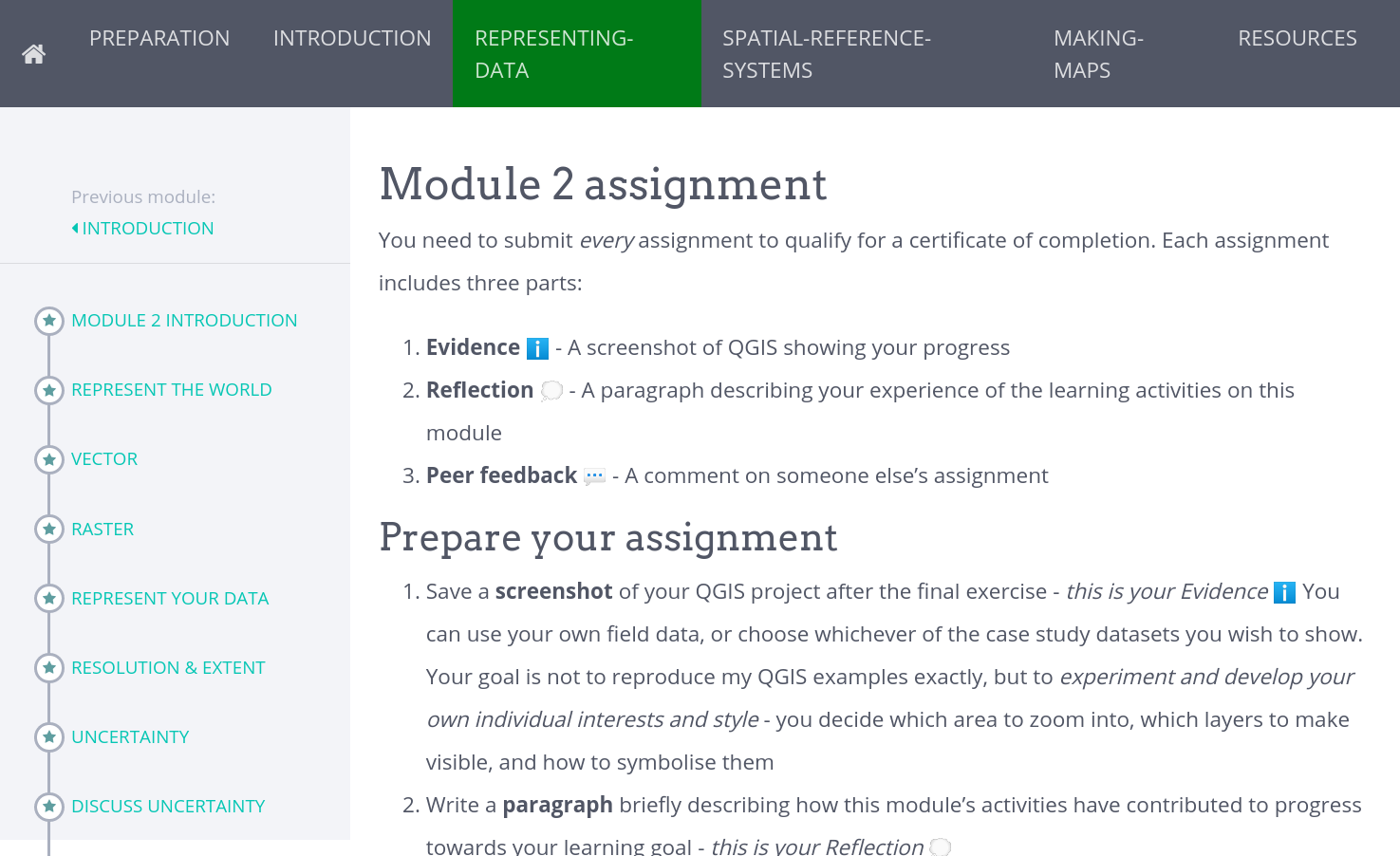
The main div becomes narrower when my browser is at full width on my wider monitor, leaving a white strip on the right, but expands to take up the full width available when my browser window is narrower
Browser at full width of 1920 screen:

Browser at c. 80% width of screen:

I’ve inspected the css/sass and can’t find the cause, but I’ve not got much experience with styling.
Can anyone explain why this is happening, and what I can do to allow the content to use the full width of the page on larger screens? It would make some of the embedded resources easier to use. Here’s the link to my site: https://courses.verdantlearn.org/gis-beginner-oe4bw (url will change when course updated later this year)
Many thanks

