Redesigning the learning circle sign up page

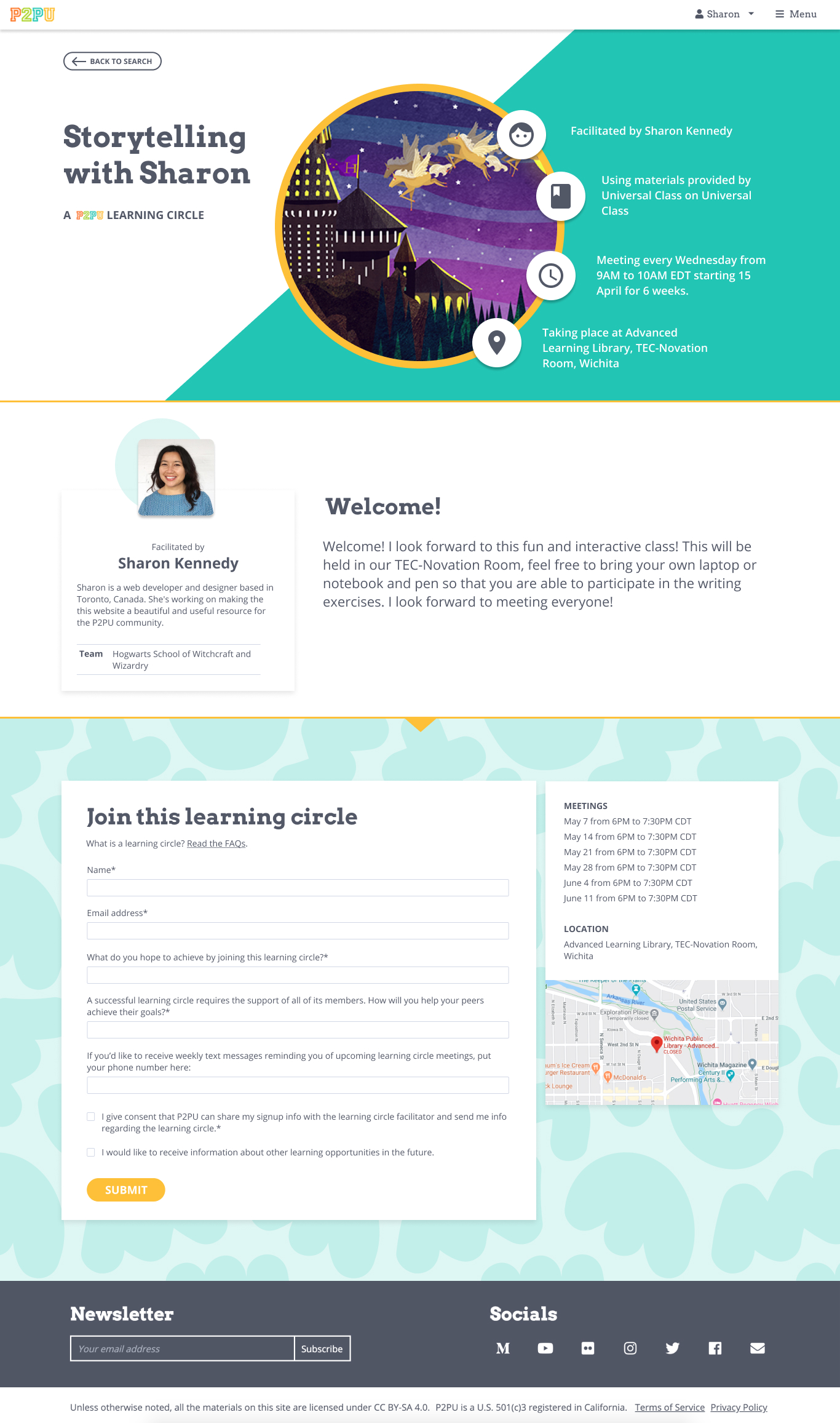
Hi everyone! I’m working on redesigning the learning circle sign up page and I would love to get your feedback on the mockups.

The overall goal is to give facilitators more room to customize the signup page and to make it more attractive and informative to learners.

The major changes are:

  • feature the learning circle image more prominently
  • include the facilitator profile
  • give more space to the welcome message, which can be used for more of a course description
  • allow facilitators to set the title of the learning circle instead of using the title of the course
  • present the learning circle information first before getting to the registration form.

LC%20SIGNUP%20V10%20(5)

LC SIGNUP V10 web.pdf (2.6 MB)

What do you think? I’m open to all questions, feedback, and suggestions!

3 Likes

Hey @SaraDixon - I believe you were the first person to mention this at our gathering in Boston. We’d love your feedback!

Hey @Jordan_Draves @Rob_Germeroth you’ve both shared great feedback about our website design before. Take a look at the latest sign page redesign! Let us know what you think :slight_smile:

Oooohhhh!!! I like this redesign!

I’m sure I’ll have other thoughts the more I think on it, but for right now, I would really like to see days of the week listed with the dates. Like, my LCs are usually a specific day of the week, currently Wednesdays. Maybe it can say “Every Wednesday 2-4pm from May 6th through June 22nd” at the top, and below it go into the details of each date?

I’m assuming those icons around the picture are clickable for more info? I think it would be fun to have the facilitators have a mini bio or something folks can read.

Ah, never mind, I just looked again at the top half of the page and saw the day of the week listed there! doh.

I do feel like having them separated looks kind of nice, but at the same time, it does seem like they are almost two separate things. Maybe there should be an icon with a link to register, that would take you further down the page for those who don’t see that part?

1 Like

@Jordan_Draves thanks for your comments, I think you’re right about adding a shortcut in the top section to get to the registration form, especially because we anticipate that facilitators will use the space in the middle section to add a longer description than the current welcome message allows, so it could require some scrolling to get to the form.

2 Likes

I’m in the middle of creating my next LC, and I have some features I’d like to see on the back-end of the public sign up page. I’m not sure if these things have been mentioned elsewhere. Apologies if they have!

Could there be a preview button at the end of the LC creation, or even with each section as we go? I’d like to see what it looks like before I publish it. I can never remember what gets included on the page, and what I need to add in the welcome message and whatnot. (As it stands, I just duplicated some of the info!)

If I have ever asked an extra question, I would love for there to be a drop down option to check off a repeat question. I forget what I’ve asked before, and this would be super helpful to see if I want to ask that again.

Being able to change the logo picture, in terms of size and what the circle focuses on would be great.

And one last thing, for the public facing side, maybe there could be a big yellow arrow between the sections pointing down into the next section so people know to keep scrolling? Just a thought.